The five-number summary to describe a distribution
The five-number summary to describe a distribution
So, we have identified the minimum, the first quartile, the median, the third quartile, and the maximum of the data set. These measures together give us a “five-number summary”, which we can use to summarize a distribution. The five-number summary is great because it includes both the measure of center and the measure of variability as well as the range of the values. For the previous example, the five-number summary is 12, 20, 33, 40, and 49. These numbers are marked with diamonds on the dot plot.
[dot plot here]
Can different data sets have the same five-number summary?
Yes, two different data sets can have the same five-number summary. For instance, here is another data set with the same minimum, maximum, and quartiles as the previous example.
[data set here]
So, two distributions with the same five-number summary can have a different shapes. In general, when two distributions have the same five-number summary, one can interpret them to have a similar but not the same distribution.
Box plot to represent five number summary
A box plot can be used to visually represent the five-number summary of a data set. It shows the first quartile (Q1) and the third quartile (Q3) as the left and right sides of a rectangle or a box. The median (Q2) is shown as a vertical segment inside the box. On the left side, a horizontal line segment—a “whisker”—extends from Q1 to the minimum value. On the right, a whisker extends from Q3 to the maximum value. The rectangle in the middle represents the middle half of the data. Its width is the IQR. The whiskers represent the bottom quarter and the top quarter of the data set.
[box plot here]
On the basis of the five-number summary and the box plot, what can we say about the distribution of study times?
Approximately 25% of students studied between 20 and 52.5 minutes……
The middle 50% of study times are between 52.5 and 65.5 minutes. The lower whisker is considerably longer than the upper whisker, suggesting that the distribution is skewed left.
The range of the middle 50% (the difference between the third and first quartiles) is called the interquartile range (IQR), and for the 28 study times, it’s 13 min. The IQR indicates that any two study times from the middle 50% of the data will differ by at most 13 minutes. The
IQR provides an additional measure of variability for a distribution.
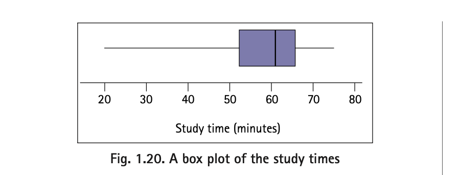