Summarizing numerical data sets using histograms
Visualizing and summarizing data using histogram
In addition to using dot plots, we can also represent distributions of numerical data using histograms.
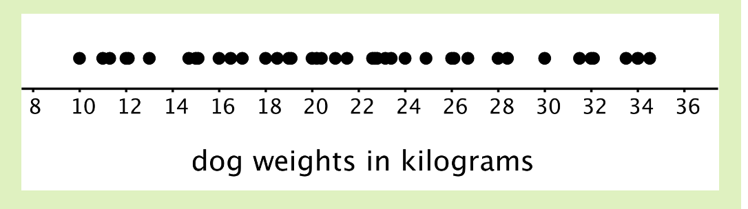
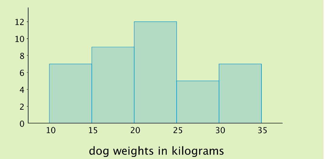
Here is a dot plot that shows the weights, in kilograms, of 30 dogs, followed by a histogram that shows the same distribution.
[dot plot and histogram go here]
In a histogram, data values are placed in groups or “bins” of a certain size (or width), and each group is represented with a bar. The height of the bar tells us the frequency for that group. The choice for the size of the bin depends on the problem at hand, and it is a convention to include the smaller value (lower bound) but exclude the bigger value (upper bound) in a bin when counting frequencies.
Building a histogram
Let’s build a histogram step by step. Below is the raw data. The minimum value is 10 and the maximum is 34, so our number line for the histogram needs to extend from 10 to 35 at the very least. We could use bins of any size, however, we choose the size of 5 because it is convenient and makes sense in the context. A size of 4 or 6 would also work. A bin size of 20 however would be too large for this problem as most of the dogs would fall into one of the bins and it would be difficult to analyze variability in the data. Similarly, a bin size of 2 would be too small as there would be too many bins and it would almost be like a dot plot.
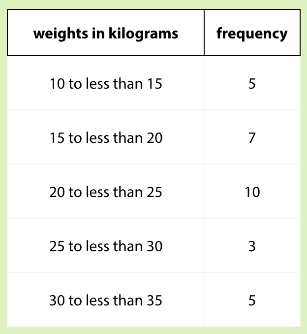
Let’s use bins of 5 kilograms for the dog weights. The boundaries of our bins will be 10, 15, 20, 25, 30, and 35. We stop at 35 because it is greater than the maximum. Next, we find the frequency for the values in each group. It is helpful to organize the values in a frequency table.
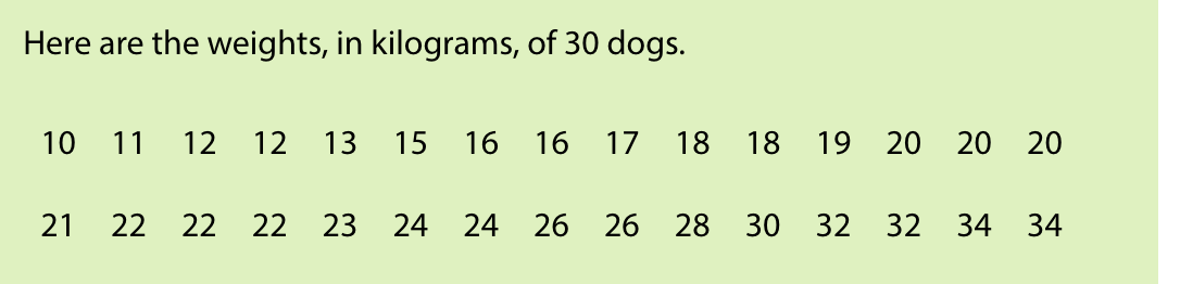
Notice that in a range 20-25, we include all values that fall within the range including 20 but excluding 25. So, 25 will fall in the range of 25-30. Again, this is just a generally accepted rule, and you may choose any rule as long as you are consistent throughout the problem and your audiences (including your teachers) are aware of your assumptions. For simplicity, we will follow the general convention to include the lower bound and exclude the upper bound.
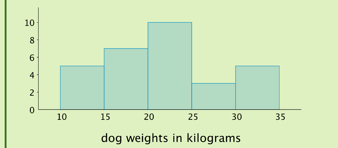
Now, let’s draw the histogram. In the histogram, the height of the tallest bar is 10, and the bar represents weights from 20 to less than 25 kilograms, so there are 10 dogs whose weights fall in that group. Similarly, there are 3 dogs that weigh anywhere from 25 to less than 30 kilograms.
Distribution table - dot plot - histogram
Notice that the histogram and the dot plot have a similar shape. The dot plot has the advantage of showing all of the data values, but the histogram is easier to draw and interpret when there are a lot of values or when the values are all different. In a histogram, the individual data values are no longer available, and consequently, the interpretation of the data cannot be as specific.
Why choose histogram over dot plots
In the last example, we looked at a case where the weight of the dogs had a very “nice” distribution. Now, let’s look at another distribution, which is not so “nice”.
At the left is a dot plot showing the weight distribution of 40 dogs. The weights were measured to the nearest 0.1 kilograms instead of the nearest kilogram. At the right is a histogram showing the same distribution.
In this case, it is difficult to make sense of the distribution from the dot plot because the dots are so close together and all in one line. The histogram of the same data set does a much better job showing the distribution of weights, even though we can’t see the individual data values. So, when there are many different weights and most occur only one time, a frequency table or even a dot plot would not be very informative. A histogram groups data and often reveals interesting patterns in the distribution.
We can see that the histogram on the right is a meaningful interpretation of the dot plot on the left. On the dot plot, we can see a denser cluster from 15 to 25, which you can also see on the histogram. Similarly, there are fewer dots in the range 25-30, which you can see as the short bar in the histogram.
The shape of the histogram says a lot about the distribution
Now, let’s analyze data using the histogram. We can describe the shape and features of the distribution shown on a histogram. Here are two distributions with very different shapes and features.
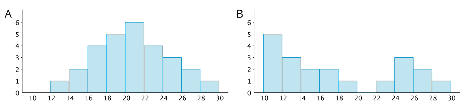
Histogram A is very symmetrical and has a peak near 21. Histogram B is not symmetrical and has two peaks, one near 11 and one near 25.
Histogram C is not symmetrical and has many values on the lower end without corresponding values at the higher end of the distribution. A distribution with this feature is referred to as “skewed”, in particular, “skewed left”. We will learn more about this later.
Histogram B has two clusters. A cluster forms when many data points are near a particular value on a number line.
Histogram B also has a gap between 20 and 22. A gap shows a location with no data values.
Summary
Histograms are a useful way of representing distributions, especially when there are many different data points and most occur only one time. Grouping data often reveals interesting patterns in the distribution. The shape of the histogram - including symmetry/skewness, peaks, and clusters - tells us a lot about the underlying distribution.