Summarizing numerical data sets using dot plots
Visualizing and summarizing data with frequency distribution tables
One way to visualize the distribution of numerical data is by using frequency tables. The term frequency refers to the number of times a data value occurs.
The frequency distribution table is a very simple table. All we do is count the number of times a particular value appears in the data. Even though it’s very simple, it allows us to look at the entire data values in a more ordered and easy manner so that we can see the pattern in the data. You can also create a Relative Frequency Table, which differs from the Frequency Table in such that rather than actual counts, we are interested in their relative occurrence. The relative frequency of each value is determined by dividing the frequency for each value by the total number of data points. Relative frequencies can be reported as decimals but are often converted to percentages.
Let’s build the frequency distribution table and the relative frequency distribution table.
[Frequency table goes here]
In this case, we see that there are a total of …. Values. The value …. Occurs the most and the value …. Occurs the least. Most of the data seem to lie between … and … In fact, if you look at the relative distribution table, you can see that …% of data lies between …. And …. As you see, frequency and relative frequency tables can be very useful to see patterns in the data.
Visualizing data with dot plots
Another representation that is very useful to represent numerical data is a dot plot. The dot plot (also called a line plot) is a fundamental graphical display for the distribution of numerical data. Like a frequency table, a dot plot also shows the distribution of a data set. Each dot represents the occurrence of a single value in the data. The dot plot displays the individual dog weight and the frequency of the various dog weights that were measured.
The dot plot below shows the distribution of dog weights..
A dot plot uses a horizontal number line and a point on the number line represents the value of a variable, i.e. weight of dogs in kilograms in this case. A data value is placed according to its position on the number line. For example, a weight of 10 kilograms must be shown as a dot above 10 on the number line. We show the frequency of a value by the number of dots drawn above that value. Here, the two dots above the number 35 tell us that there are two dogs weighing 35 kilograms.
Answering statistical questions using dot plots
One of the main reasons we collect and analyze data is that we are interested in learning what is “typical,” or what is common and can be expected in a group. One way to describe what is typical or characteristic of a data set is by looking at the center and spread of its distribution. Sometimes it is easy to tell what a typical member of the group is. At other times, it may not be obvious. Let’s look at some examples to understand it more.
[Example goes here]
Let’s look at two distributions represented on dot plots. The first plot is a distribution of cat weights and the second one is a distribution of dog weights.
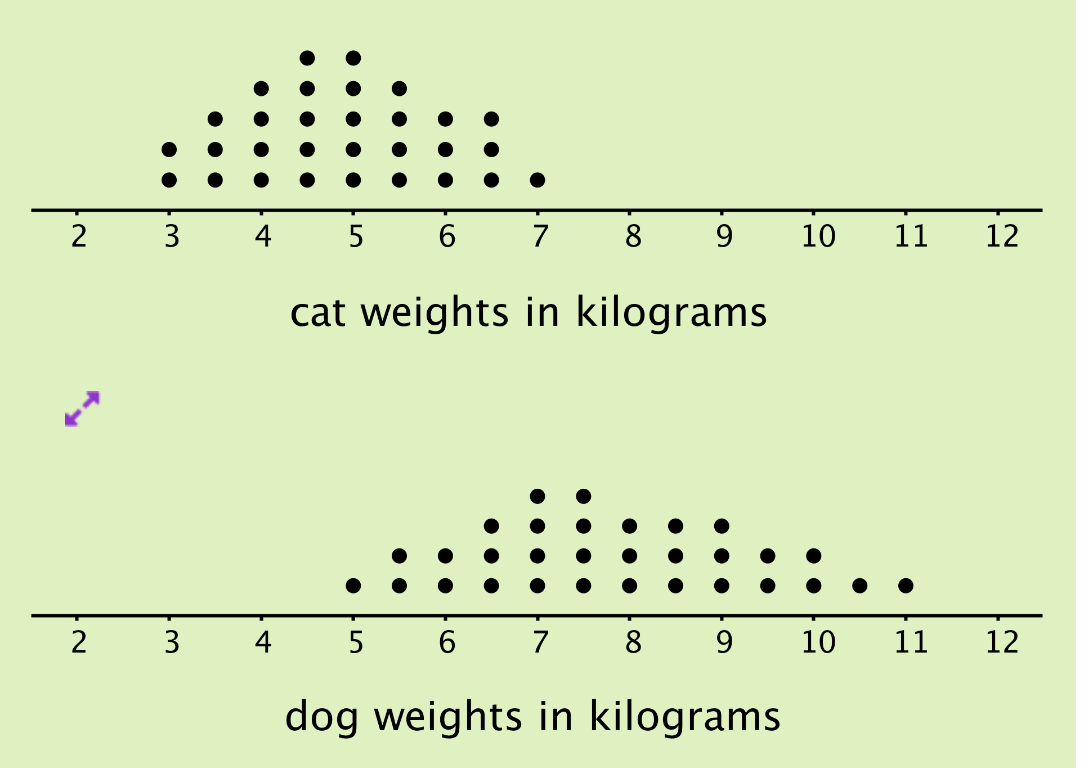
What do you observe? What do you think is the typical weight for cats and for dogs?
On the above dot plots, the collection of points for the cat data is further to the left on the number line than the dog data. Based on the dot plots, we may describe the center of the distribution for cat weights to be between 4 and 5 kilograms and the center for dog weights to be between 7 and 8 kilograms. We often say that values at or near the center of distribution are typical for that group. This means that a weight of 4–5 kilograms is typical for a cat in the data set, and a weight of 7–8 kilograms is typical for a dog.
We also see that the dog weights are more spread out than the cat weights. The difference between the heaviest and lightest cats is only 4 kilograms, but the difference between the heaviest and lightest dogs is 6 kilograms. A distribution with greater spread tells us that the data have greater variability. In this case, we could say that the cats are more similar in their weights than the dogs.
In future lessons, we will discuss the different ways to measure the center and spread of a distribution. Right now, we are only making guesses about the center and spread from the dot plots.